"No worthy problem is ever solved within the plane of its original conception"...
Albert Einstein
My desk is a mess. Pens and reading glasses tossed with a lack of concern for their intended purposes, a fresh cup of coffee in my cherished Brookings mug, a half used giant mason jar of water and my stack of index cards add to the less glamorous detritus of mail opened and unopened, books pulled off the shelf for contemplation or clarity about a theme or topic I am rendering and those things that I don’t want to throw out but for the moment—don’t seem to belong anywhere in particular.
Oh. Before I forget let me share with you the utility of having index cards nearby. The French have a word for that conversation you had where moments, hours, or days later you pine for what you should have said,"esprit de l’escalier” or staircase wit.
Now that my first published book is out in the world, I am summoned to speak on a wide variety of topics. I like to keep the focused points of what matters on a small stack of index cards next to my second monitor. The one with the webcam perched on the top. It helps me focus my thoughts when I need to send off a comment or I am asked to offer a preferred introduction to my work.
For example:
How does the built infrastructure influence change in our built environment?
It is not about profound poverty or access to healthcare it is about persistent blockade to the flow of capital resources and economic investment
Remembering the distinction between linear (what data impacts your model) and logistic regression (probability that data you gave your model belongs to a certain category)
Bringing it back to the title of this post, "No worthy problem is ever solved within the plane of its original conception”—Albert Einstein, I thought I would share a few steps in how I build out a talk. Yes it is about the data but I have always wanted the topics to inform or awaken an idea in the audience. What value would it have if conversations ended within the walls where they were whispered?
I am the invited geospatial keynote for Data Day Texas in January and I am figuring out the type of session I want to lead. So, where do I start?
Building a Presentation
If you are not looking at location intelligence or the “where” of a seemingly intractable problem, well, you might be part of the problem. For years I was asked to stratify data by race. It never made sense to me. Race is not a biologic proxy for anything. Name the biology, do the research. Being lazy and making race perform a senseless task is a waste of time. It is a social construct and does have a role but few are using it in the right capacity. Using race as a marker makes even less sense in Puerto Rico where the population is nearly 100% Hispanic.
Census data tells us that the poverty rate is more than double the rate in the United States—again, otherizing a territory. And location matters here as well. Where is poverty most profound? What might be driving the inequity within and outside of Puerto Rico?
Demographic data visualized is always more powerful.
The darker areas below have more people living under the poverty level by census tract than anywhere else in the region.
Zooming in to the dense dark appearing polygons in the northern region provides more data.
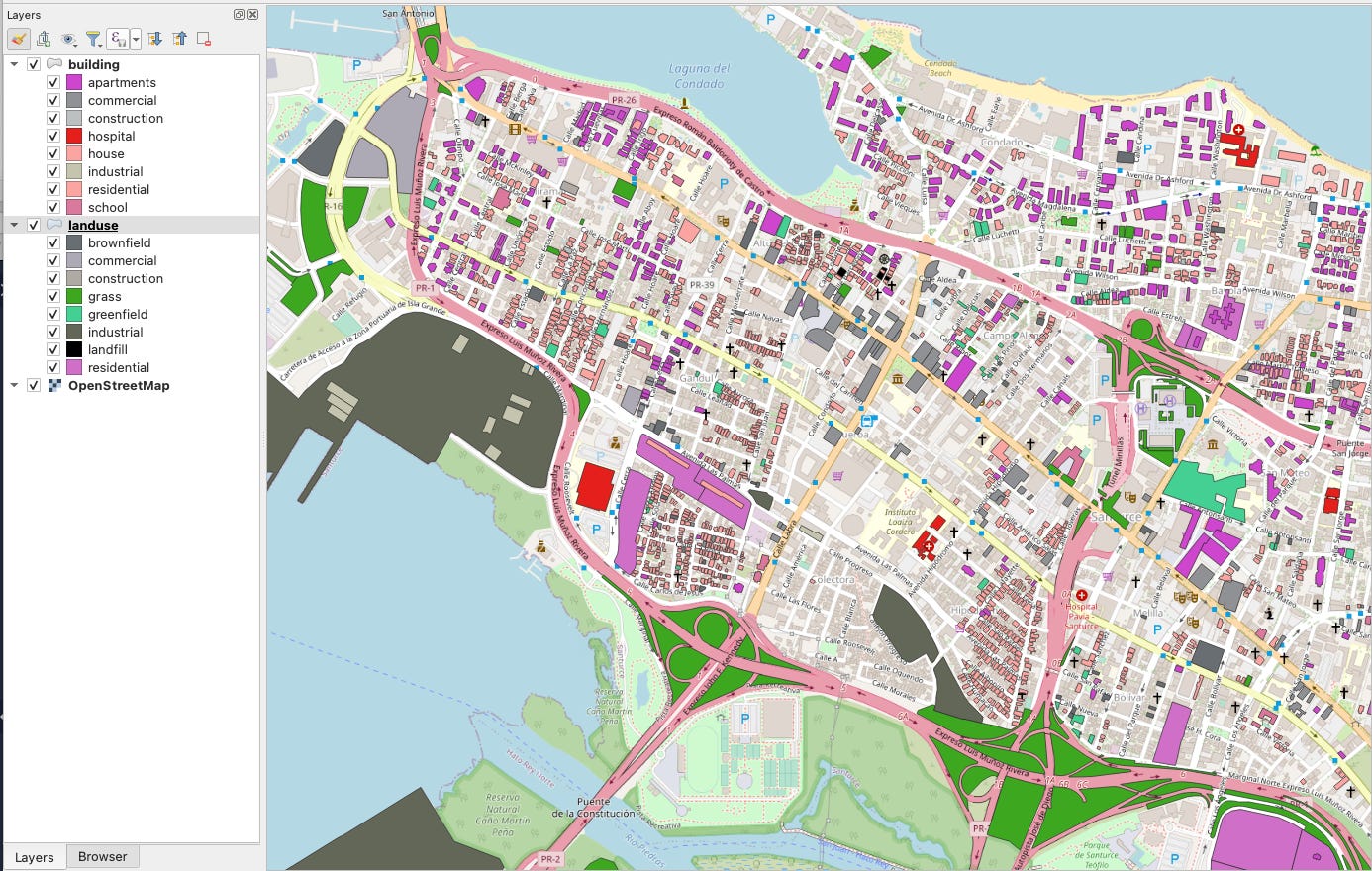
These images were rendered in QGIS an open-source GIS tool.
Opportunities to work with the QGIS Google Earth Engine plugin will follow in the newsletter series for Python for Geospatial Analysis.
While I am still discovering the “bones” of a location question I head over to USGS National Map Viewer (if I am focusing on U.S.)
I am interested in the tumultuous history of Puerto Rico. I have satellite data that depicts the ravages of hurricanes, earthquakes, and a substandard power grid as a place to start telling the story. You can see a raster image showing satellite data over an area within Puerto Rico. All of this information is publicly available for anyone to explore.
Each step, as I dig a little deeper, involves a bit more technology. In this dataset I am again looking at satellite data. Looking at vegetation loss and changes in landcover could point to rates of deforestation, mining or other industrial pursuits threatening ecosystems, livelihoods, and health outcomes.
I begin with infrastructure and build from there. We can zoom in on communities to see the buildings, land-use and many more variables of interest.
What can the night sky tell us about the power infrastructure? The frame on the far left is showing power loss during September 2022. Why? We need to explore events to see what sort of provocation or limitation of the grid created the vast power outage.
The middle image is the impact of a major storm. We know where to look for areas most impacted and at greatest need and assistance. The image on the far right is the satellite image of San Juan.


My intent was to show you how cinematic presentation development can be. Most stories aren’t linear at all and are authentically developed by simply being curious—and exploring other planes like “location” to address questions or seemingly intractable problems.
Paid subscribers will be provided how-to videos showing how the analysis and story develops.
Stay tuned…


